BMW font design
Minimalist font design for BMW adverts.
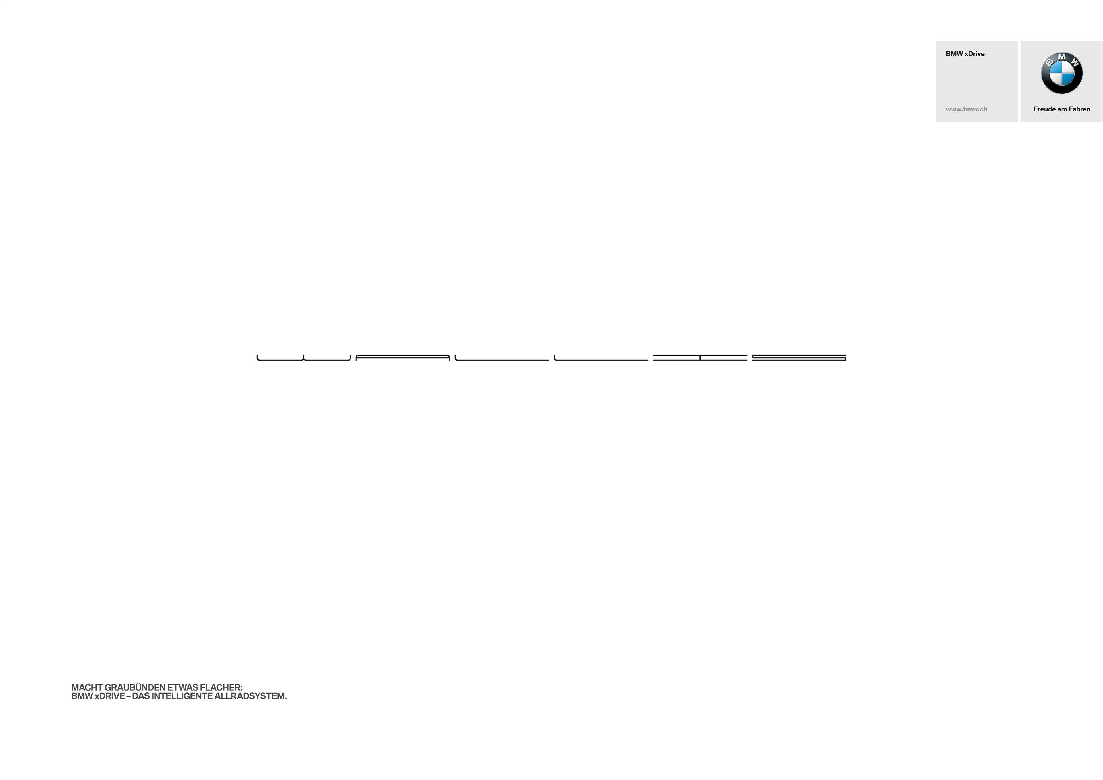
A great type project that takes the names of famous mountains and shows them flattened by the cars superior campibility over them.
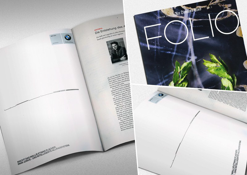
These adverts are presently running in the press and also feature on numerous billboards and hordings including outside their HQ. This very minamalist approach was designed to cut through the clutter in publications.
Final Adverts for BMW


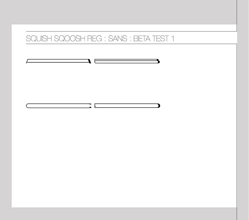
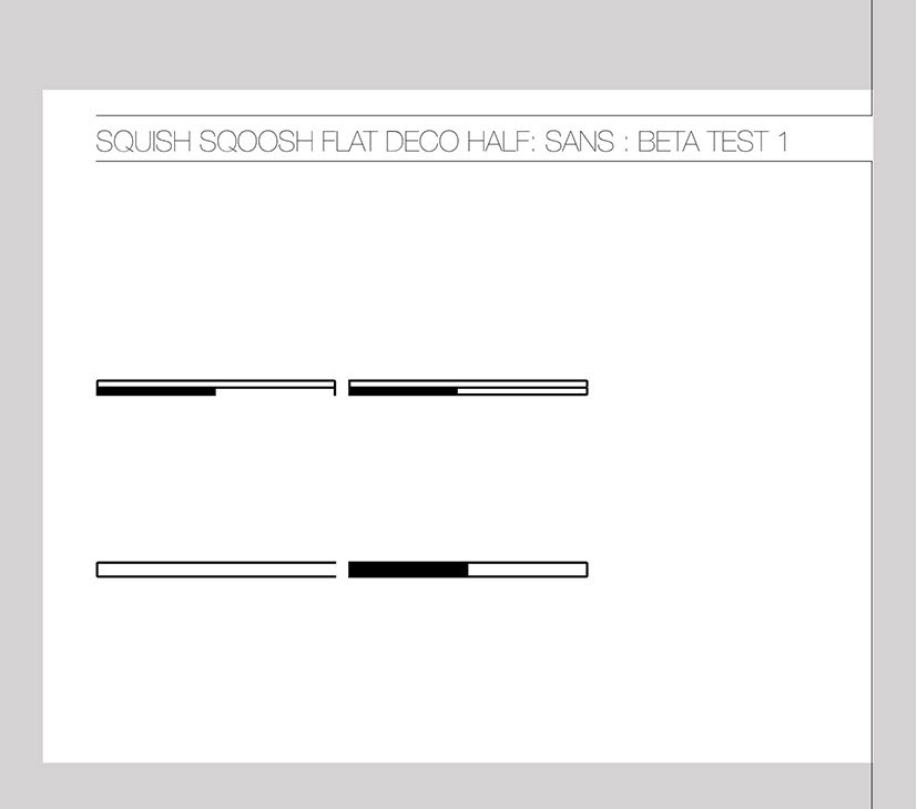
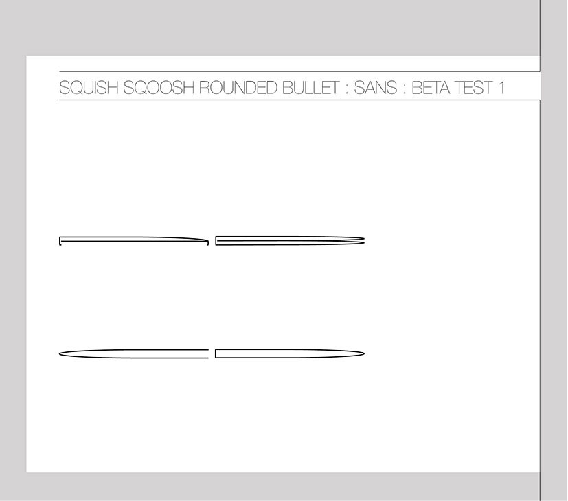
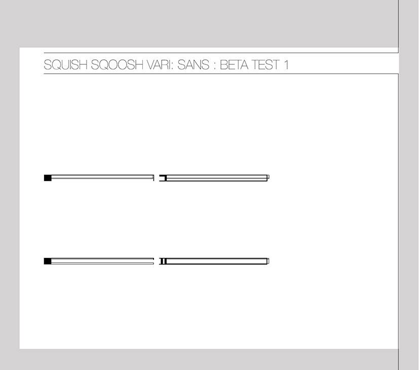
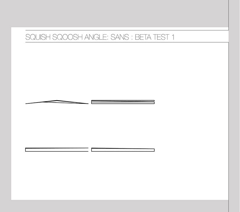
Stage 1 - options and development.
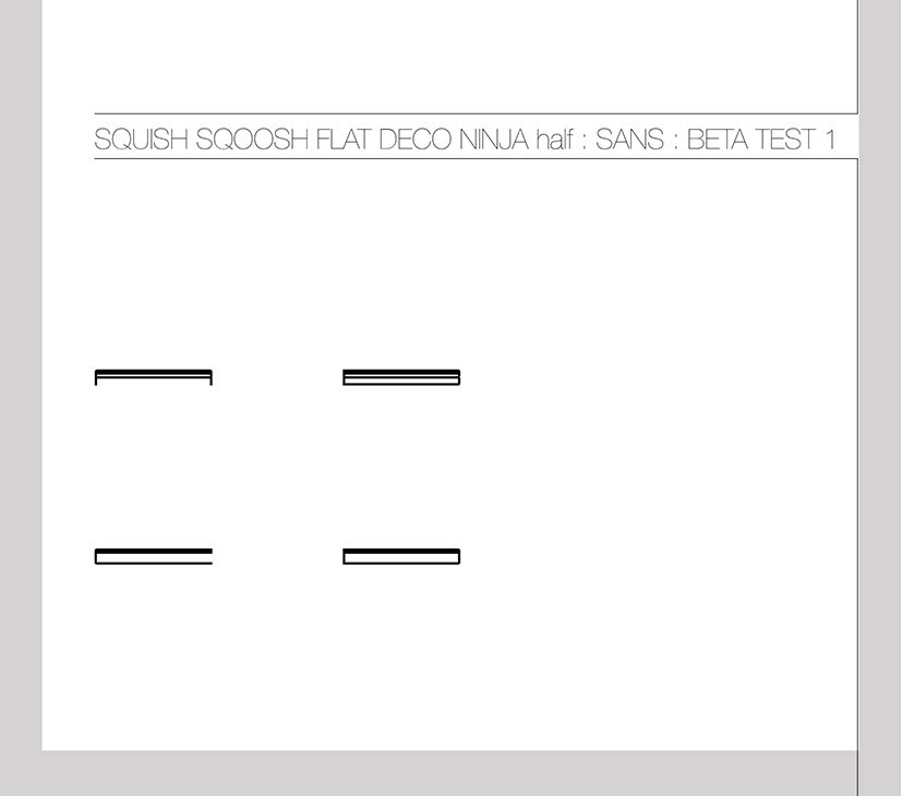
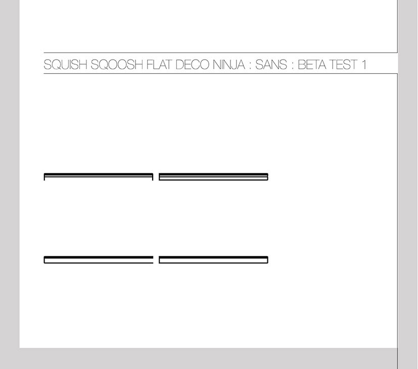

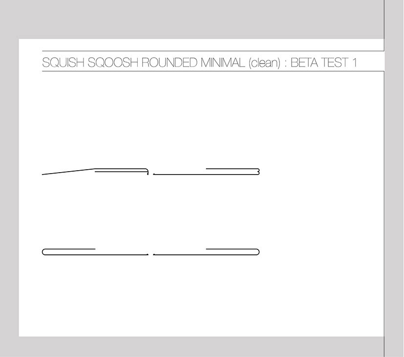
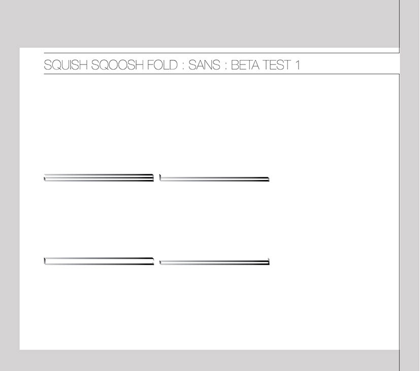
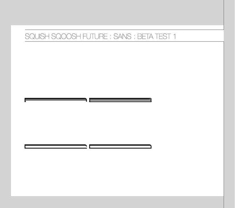

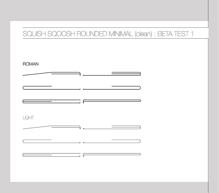
Stage 2 - the direction as choosen and to options from the clients selection developed
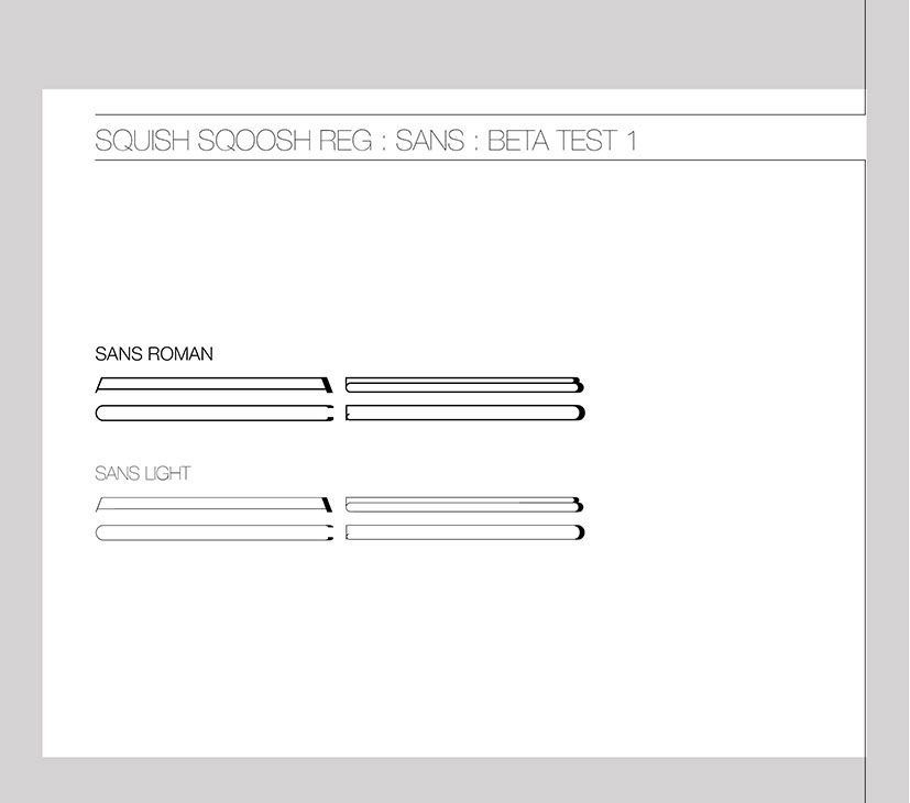
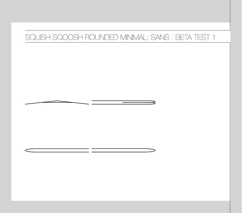
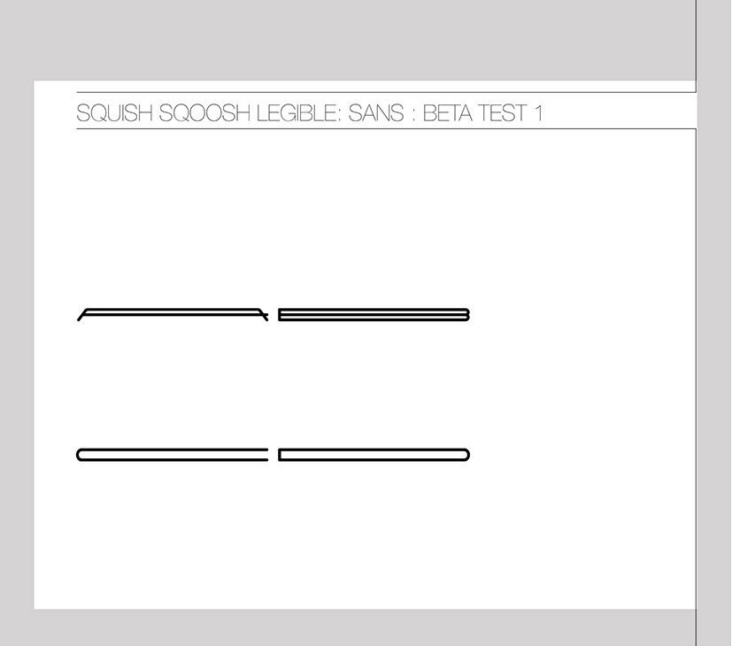
Stage 3 - client went back to a simpler more legible version. Here's the full typeface.
